Role: Junior Visual & Interaction Designer
My Responsibilities: UI | UX | Research | Testing | Prototyping
Company: Your.MD
Platform(s): Android, iOS
INTRODUCTION
It was only skin deep….
Your.MD’s app contained a breadth of health topics and knowledge which offered a single ‘reactive’ experience.
Examples of this included their symptom checking routines, quizzes and health assessments. After completing any of these journeys, users were offered little to no reward or motive to return to the app for more. This was confirmed by analytics, which identified that users would download the app seeking help to either treat or diagnose a condition, and after single time use either uninstall or go dormant.
THE QUESTION
Are people interested in improving their health through apps?
After launching a small survey in the app, we saw that a large amount of users were visiting the YMD app ‘healthy’. This was an interesting discovery as primarily the app was advertised and positioned as a ‘smart symptom checker’ to aid with assessing and understanding symptoms and conditions.
Whilst this highlighted the majority of users were entering the app for the symptom checker and health information, it also raised the question:
Can the YMD app offer more than just a diagnostic symptom checking experience?
We wanted to create a test that attempted to engage users over longer periods of time to make the app not just ‘reactive’ but ‘proactive’. I felt this concept, if done correctly could offer ‘healthy’ users a new product experience with YMD. We called this idea ‘Health Plans’ which aimed to increase engagement and encourage users to develop a stronger relationship within the app by offering relevant and personalised recommendations over time.
THE OPPORTUNITY
Teaching an old dog new tricks
Your.MD already had a vast amount of medically approved health content. They had mapped over 250 conditions and had access to hundreds of NHS approved medical articles. How could this content be utilised into making an engaging and more sticky user experience? The starting point was a feature called ‘Health Assessments’. This feature offered questionnaires that assessed a user on a selection of health topics. The result was a health score and vague but useful information. These features were used frequently but never prompted more action from the user after completing their assessment.
Our Hypothesis:
Engaging with users after they’ve completed a health assessment would motivate them to use the product more.
THE PROCESS
Cheap and cheerful.
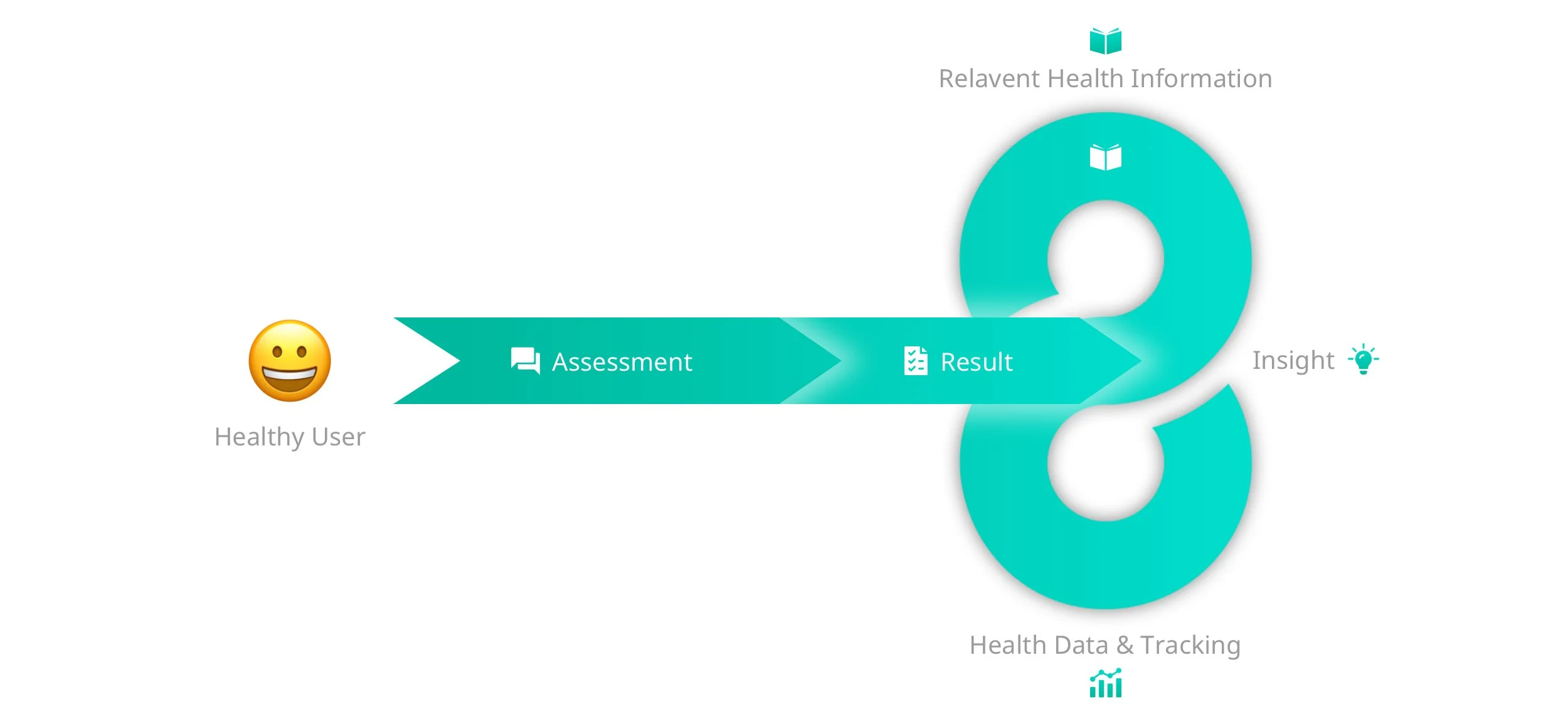
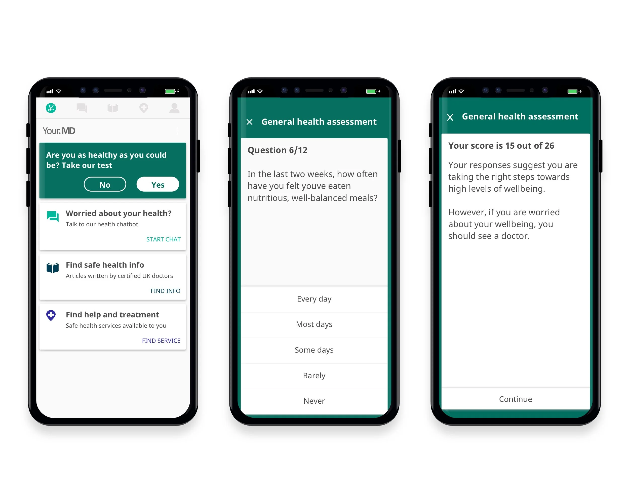
Working closely with the lead UX, we developed an ‘MVP’ health plan that combined existing functions within the app. The MVP brought together daily health tracking, health articles and partners services to form a 28-day plan around general health. Users started by completing a small assessment consisting of 12 questions regarding their health. I felt the assessment was essential in setting users expectations. We needed some of their information to make the plan feel relevant.
After receiving their score, we introduced a pop-up which offered users the opportunity to sign-up to a health plan. The sign-up was the real test to see if users were motivated to establish a longer term relationship with the app through tracking and relevant health content.
Once on the plan, we encouraged users to track their health everyday whilst being given access to relevant health articles on select days through push notifications. The plan lasted 28 days with four themes lasting a week each. Initially I felt it optimistic to keep users for the duration of the plan, but it felt like a duration long enough to encourage healthy habits.
Health Plan Structure:
Week 1: Sleep
Week 2: Diet
Week 3: Exercise
Week 4: Mindfulness
We used Google Analytics to measure users engagement across several key areas of the MVP. These included content engagement, number of actions, notification open rates, 7-day and 28-day retention.
THE RESULT
Expectations vs reality!
The MVP was tested live and had a sign-up rate of over 90%. It suggested users were curious and motivated to receive the content from the plan with the expectation it would help them improve their health.
The feature gained a 7 day retention of approximately 15%. Naturally, we saw a large drop off and uninstall rate after the first two days as users realised the plan wasn’t meeting their expectations.
Given the fact that this was only an MVP test and the content currently lacked adequate substance, it highlighted a large opportunity and was classed as a huge success.
People were interested in using apps to improve their health!
Due to the success of this project, the company developed ‘Health Plans’ further by adding more content, functionality and visual improvements.
It was clear from the MVP that users expectations were not met by the initial version, so the next iteration began by focusing on improving the following:
Greater personalisation through data capture
More relevant and higher quality content
A more gamified and visually pleasing UI
More tailored assessment questions and a greater breakdown of user’s results
THE IMPACT
From reactive, to proactive!
This MVP paved the way to developing the latest version of this feature; ‘Health Hubs’. This more advanced health plan allowed users to focus on longer term goals in particular areas of their health such as sleep and chronic pains. This more personalised and dynamic iteration was the result of additional specific plans, content and assigned partner services.


